Your Web Font Stack Is a House of Cards — Here's How to Build Something That Actually Holds
Let's set the scene. You've obsessed over your brand's typeface. You licensed something beautiful — maybe a geometric sans-serif with just the right amount of personality, or a refined serif that makes your copy feel authoritative without being stuffy. You drop it into your CSS, spin up a preview in Chrome on your MacBook, and everything looks immaculate.
Then a user opens your site on a five-year-old Android phone with a spotty 3G connection in rural Ohio. What they see? Georgia. Maybe Times New Roman. Possibly something so far from your vision that it might as well be a different website.
This isn't a hypothetical. It's happening to thousands of sites right now, quietly undermining brand identity and user experience in ways that most designers never bother to audit. Font stacks — the ordered list of typefaces your CSS falls back through when a preferred font isn't available — are the unglamorous backbone of web typography. And most of them are broken.
What a Font Stack Actually Does (And Why Most People Get It Wrong)
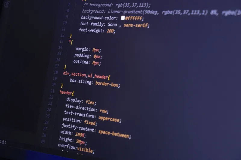
At its core, a font stack is a contingency plan. You write something like font-family: 'Neue Haas Grotesk', 'Helvetica Neue', Helvetica, Arial, sans-serif; and the browser works down the list until it finds something it can render. Simple enough in theory.
The problem is that most designers treat the fallback fonts as an afterthought — a quick copy-paste from a Stack Overflow answer written in 2014. They focus entirely on the first entry in the stack, the web font they've actually licensed, and assume the rest will just handle themselves.
They won't.
Here's what actually happens when your web font fails to load: the browser doesn't pause politely and wait. Depending on its default behavior and your CSS configuration, it either shows invisible text while the font downloads (Flash of Invisible Text, or FOIT) or immediately renders your fallback font and swaps it out when the web font arrives (Flash of Unstyled Text, or FOUT). Both experiences are jarring. Both damage credibility. And both are almost entirely preventable.
The Hidden Cost of Font Loading Delays
Before we get into building better stacks, it's worth understanding what's actually at stake beyond aesthetics.
Google's own research has consistently shown that page load speed correlates directly with bounce rate. A one-second delay in mobile load times can reduce conversions by up to 20%. Web fonts, when poorly implemented, are a significant contributor to that delay — especially when you're loading multiple weights and styles from an external CDN without any caching strategy.
Some of the most egregious examples come from media and e-commerce sites that load six or seven font files before rendering a single word of content. There's a well-documented case study in the web performance community around a major retail brand that was loading over 400KB of font data on every page visit — including weights they weren't even using. The fallback experience for users on slower connections was a full second of blank text fields. On a checkout page. You can imagine how that math worked out.
The fonts themselves aren't the villain here. The implementation is.
Building a Font Stack That Actually Works
So what does a bulletproof font stack look like in practice? It's built in layers, and each layer has a specific job.
Layer 1: Your web font. This is your licensed or self-hosted typeface — the one that represents your brand. Make sure you're loading only the weights and styles you actually use, and serve it in WOFF2 format, which offers the best compression and near-universal modern browser support.
Layer 2: A system font that closely matches your web font's metrics. This is where most stacks fall apart. Designers drop in Helvetica Neue as a fallback for a custom geometric sans-serif, not realizing that the x-height, line spacing, and character width are dramatically different. When the swap happens, the layout shifts — sometimes violently. The goal here is to choose a fallback that's visually close and metrically similar to your primary font. Tools like Font Style Matcher (a free browser tool) let you overlay two fonts and adjust CSS properties like line-height, letter-spacing, and font-size to minimize visual disruption during the swap.
Layer 3: A generic system font family. This is your sans-serif, serif, or monospace declaration — the browser's absolute last resort. Don't skip it. Without this, you're leaving the rendering entirely up to the browser's default, which varies wildly.
The modern system font stack shortcut. For UI elements where brand typography matters less than performance, consider leaning on the system font stack entirely: font-family: -apple-system, BlinkMacSystemFont, 'Segoe UI', Roboto, Oxygen, Ubuntu, sans-serif;. This renders your text in whatever the user's operating system considers its native UI font — San Francisco on Apple devices, Segoe UI on Windows, Roboto on Android. It's fast, it's legible, and it never fails to load because it's already on the device.
The font-display Property Is Not Optional
If you take one technical note away from this article, make it this: use the font-display descriptor in your @font-face declarations.
font-display: swap tells the browser to immediately render text using your fallback font and swap in the web font once it's loaded. This eliminates invisible text and keeps your content accessible during load. font-display: optional goes even further — it gives the browser a very short window to load the font, and if it misses that window, it skips the web font entirely for that page load. For performance-critical sites, optional is worth serious consideration.
Neither of these properties will fix a bad font stack, but they make a good one dramatically more resilient.
Auditing What You've Already Got
If you're not sure whether your current font stack is working as intended, here's a quick gut-check process:
- Open Chrome DevTools and go to the Network tab. Filter by "Font" and reload the page. Note how many font files are loading, their sizes, and their load times.
- Use the Rendering panel to simulate slow 3G and watch what your site looks like during load. If you see invisible text or a jarring layout shift, your stack needs work.
- Throttle your connection and navigate to a few key pages — especially any page where typography is doing real communicative work, like a landing page or product description.
- Test on an actual Android device if you can. Mac and Windows system fonts differ significantly from what Android users see, and emulators don't always tell the full story.
Typography That Works for Everyone, Not Just Your Preview Tab
The best type designers understand that a font's job isn't done when it's drawn — it's done when it's rendered correctly on the widest possible range of devices and conditions. The same principle applies to how we deploy type on the web.
Building a thoughtful font stack isn't glamorous work. It doesn't make it into portfolio case studies or get celebrated on design Twitter. But it's the difference between a brand experience that holds together across a Pixel 4 in Kansas City and a Retina MacBook in San Francisco — and one that quietly falls apart the moment you stop looking.
Your typeface deserves better than a broken fallback chain. So do your users.