Six Seconds of Serif: How Your Resume Font Is Sabotaging Your Job Hunt
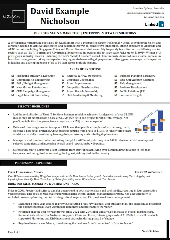
Photo: Colin8317a, CC BY-SA 4.0, via Wikimedia Commons
Here's a number that should change how you format your resume: six.
That's how long, on average, a recruiter spends on an initial resume scan, according to widely cited eye-tracking research from Ladders Inc. Six seconds. Before they read a single bullet point about your revenue growth at that SaaS startup, their brain has already processed your typeface — and formed an opinion.
We spoke with recruiters and hiring managers in Chicago, Austin, and New York about what fonts actually signal in 2025. Their answers were more opinionated than you'd expect.
What's Happening in Those Six Seconds
"I don't read the first pass — I feel it," says one talent acquisition lead at a mid-size fintech company who's reviewed thousands of applications. "Density, hierarchy, whether the thing breathes. Font choice is the fastest proxy for 'does this person have taste and attention to detail.'"
Multiple recruiters described the same pattern: a resume in a messy or dated font puts their brain in skeptical mode before the content gets a fair shake. A clean, confident typeface does the opposite — it buys the candidate the benefit of the doubt.
The stakes are real. A study from Franklin University found that content presented in an appropriate typeface was rated as more credible and more professionally written than identical content in a poorly chosen font. Same words. Different verdict.
The Fonts That Read as Competent
Calibri. The unsexy default that quietly wins. Recruiters called it "invisible in a good way." If you're in finance, operations, healthcare, or government-adjacent work, this is your safe harbor.
Garamond. The dark horse. Several hiring managers described it as "elegant without trying hard." Great for academia, law, nonprofits, and anything where you want to signal thoughtfulness.
Helvetica or Arial. Cold? Maybe. But clear, neutral, and impossible to object to. Tech and consulting recruiters had zero complaints.
A well-set sans like Lato or Source Sans. Modern, warm, readable on screens — which matters, because your resume will almost certainly be read on a phone first.
The Fonts That Read as Creative (Use With Judgment)
Futura. Geometric, confident, a little design-y. Fine for creative roles; potentially polarizing for a bank.
A tasteful serif like Freight Text or Baskerville. Signals editorial sensibility. Writers, marketers, and brand people can pull this off well.
The rule from every creative director we asked: one expressive choice, applied to your name or section headers only. Body text stays boring. Creativity is knowing where the ceiling is.
The Fonts That Read as Careless
Comic Sans. Yes, it's still happening. Yes, it's still an instant rejection in most recruiters' eyes. One hiring manager told us it's "the single fastest way to make me close the PDF."
Papyrus and Curlz. You'd be surprised. We were surprised. Don't.
Overly condensed display fonts. Anything you have to squint at reads as someone hiding something. Recruiters won't squint. They'll move on.
Anything your printer's driver substituted. If you use an obscure font and export to Word instead of PDF, you might be sending recruiters a resume in Times New Roman anyway — or worse, a broken fallback. Always export to PDF with fonts embedded.
The ATS Wrinkle Nobody Mentions
Beyond human perception, there's the robot layer. Applicant tracking systems parse your resume before a human sees it, and exotic fonts can mangle that parsing — scrambling dates, merging job titles, tanking you before a recruiter's six seconds even begin.
Stick with widely supported typefaces, single-column layouts, and standard section headings. The fanciest resume is the one the software can actually read.
The Times New Roman Plot Twist
Here's the surprise: Times New Roman isn't the villain anymore. Several recruiters told us it now reads as "deliberately classic" — even a little retro-confident — especially from candidates applying to law firms, academia, or legacy institutions.
The real sin of 2025 isn't being dated. It's being unconsidered. A resume in default Calibri with clean spacing beats a resume in a trendy font with chaotic margins every single time.
Six seconds isn't a lot. But it's enough time for a good typeface to say the one thing every recruiter wants to hear: this person sweats the details. Let your font say it before you can.