48 Hours to Launch: One Type Designer's Descent Into the Final Glyph
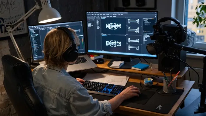
Photo: type designer workspace desk with font editing software on monitor, via images.stockcake.com
The spreadsheet has 647 rows. Each one is a glyph. Each one needs a final pass before Friday.
Mara Okafor has spent eleven months designing her first commercial typeface — a warm, slightly quirky serif family she's calling Ferndale. In roughly forty-eight hours, it goes live on her website and three font marketplaces. She has sold exactly zero fonts before. She is, by her own admission, "running on cold brew and denial."
This is what the end of a type design project actually looks like.
Thursday, 9 A.M.: The Glyph Audit Nobody Warned You About
The morning starts with what Mara calls "the humiliation pass" — opening every character at 2400% zoom and looking for the mistakes that somehow survived ten months of work. A lowercase g whose ear is a hair too heavy. An ampersand she redesigned twice and still isn't sure about.
"Nobody tells you this part," she says, not looking up from her screen. "The font is done. It's been done for weeks. But done is a decision, not a state."
She finds four problems in the first hour. Two are trivial. One — a spacing collision between fy in the bold italic — takes ninety minutes to fix properly. The fourth is the worst kind: a kerning issue that only appears in a specific ligature combination at display sizes. She almost ships without fixing it. Almost.
The Pricing Spiral
By early afternoon, the technical work stalls for a reason no design education covers: the price.
Mara has rewritten the pricing page six times this week. Her single-license tier has bounced between $35 and $60. The family bundle has gone from $180 to $240 and back down to $210. She's spent two hours on Reddit threads about indie type pricing and one very long voice memo to a designer friend in Portland who released a sans last year.
"The problem is you have no idea what your work is worth," she says. "A big foundry has sales data. I have vibes and a mortgage."
She eventually lands on $45 per style, $200 for the family — a launch discount from $250 that expires after two weeks. The discount, she admits, is mostly psychological armor. "If it flops at full price, I'll tell myself it was the discount's fault."
The Marketing Scramble
Friday morning, forty hours before launch, Mara does something she's been avoiding for a month: she makes the social content.
Twelve posts. A launch thread. An email to a newsletter she started eight months ago and then ignored for six of them (1,240 subscribers — she checks the number three times while writing). A short video of the typeface being drawn, which takes two hours to record because she keeps saying "um" and one take features her cat screaming off-camera.
"Indie type designers are all introverts with a product that requires a personality," she laughs. "It's the worst possible combination."
She also does the one thing every veteran told her to do: she emails five design newsletters and two font curation accounts personally. Short, human, no press release. Three respond within hours. One wants an interview. Mara walks away from her desk and screams into a couch cushion, happily.
The Final Hour
Saturday, 6 P.M. The files are zipped. The license PDF is proofread twice — once by Mara, once by her partner, who caught a typo in the e of the license agreement that would have legally said something different than intended. The EULA now correctly covers webfont usage. Small thing. Massive thing.
She uploads the files, triple-checks the checkout flow with a test purchase, and then sits with her finger over the publish button for a full four minutes.
"Eleven months of my life is a zip file," she says. "That's the whole industry right there."
She hits publish at 6:17 P.M. on a Saturday, because someone told her Sunday morning is when designers check email, and because she cannot physically wait any longer.
Epilogue: The Numbers, One Week Later
Ferndale sold 23 licenses in its first week. Not viral. Not a flop. Enough to cover the cost of the fonts she bought while making it, plus a little more.
Mara's verdict on the launch experience: "The design was maybe 30% of the work. The other 70% was kerning the business. And nobody teaches that class."
She's already sketching her next family. A geometric sans, she thinks. Something with fewer italics.