Gone But Not Forgotten: The Story Behind Discontinued Fonts and How to Replace Them
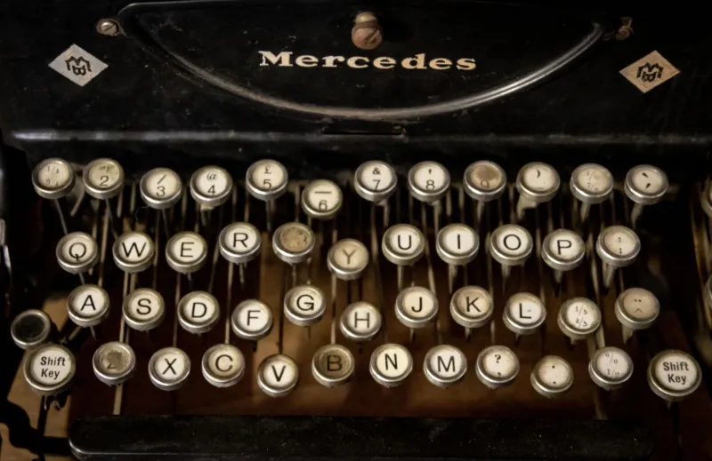
There's a particular kind of grief that hits when you open your font manager, search for a typeface you've used for years, and find nothing. No download link. No product page. Just a 404 error where your favorite typography used to live. If you've been designing long enough, you've felt this.
Fonts disappear all the time — and not just the obscure stuff. Beloved, widely-used typefaces get pulled from catalogs for reasons that have nothing to do with quality. Understanding why it happens, and knowing where to look for replacements, is quickly becoming one of the more underrated skills in a designer's toolkit.
Why Foundries Pull the Plug on Popular Typefaces
It rarely comes down to the font being bad. More often, it's business.
When foundries merge or get acquired — something that's happened at a dizzying pace over the past decade — entire back catalogs get reviewed. Fonts that overlap with the acquiring company's existing library get axed to avoid cannibalization. Others get caught in licensing disputes, particularly when a typeface was built on a commissioned project for a single client who later claimed exclusivity.
Then there's the maintenance issue. Type design isn't a set-it-and-forget-it situation. OpenType standards evolve, variable font support becomes expected, and Unicode character sets keep expanding. Updating an older typeface to meet modern technical requirements can cost nearly as much as designing a new one from scratch. For foundries running lean operations, the math sometimes doesn't work out in favor of the old guard.
Some retirements are even more personal. Independent type designers who built a reputation on a single breakout font sometimes choose to retire it intentionally — pulling it from circulation to push their audience toward newer work, or simply because they've outgrown it creatively.
"There are fonts I made in my early twenties that I'm genuinely embarrassed by now," one independent type designer based in Brooklyn told us. "Keeping them available feels like leaving your worst college essay pinned to your front door."
The Designer's Dilemma: Projects Built on Borrowed Time
The real damage shows up downstream. Brand systems built around a discontinued font suddenly face an identity crisis. Web developers discover that a font they've been serving via a third-party CDN has been quietly removed. Print designers realize mid-project that the typeface they specified is no longer licensable for commercial use.
This isn't hypothetical. When Linotype restructured its font licensing under the Monotype umbrella, dozens of designers found themselves unable to legally renew licenses for fonts embedded in long-running client projects. The fonts still existed on their machines — but technically, using them in new work without a valid license was a violation.
The lesson most working designers have internalized the hard way: don't build a brand identity around a single foundry's commercial font without a contingency plan.
Digital Archaeology: How to Find What You Had
Before you start hunting for replacements, it's worth doing a bit of detective work. Just because a font disappeared from its original source doesn't mean it's completely gone.
Check archive sites and legacy distributors. Fonts.com, MyFonts, and FontShop maintain historical records of discontinued typefaces. Sometimes the font is still technically purchasable through an older distribution agreement, even if the foundry's primary site no longer lists it.
Search for revival projects. Type revival is a legitimate and thriving practice. Many beloved discontinued faces have been lovingly reconstructed — sometimes by the original designer, sometimes by a new team with explicit permission. The revival often improves on the original, adding extended language support or variable font functionality.
Look at specimen archives. The St. Bride Library in London and the Type Archive hold physical specimens of typefaces going back centuries. For American designers, the Hamilton Wood Type & Printing Museum in Two Rivers, Wisconsin is an incredible resource. These archives sometimes point toward digital versions you didn't know existed.
Finding the Spiritual Successor
When the original truly isn't available, the goal shifts from recovery to replacement. And "replacement" doesn't mean finding something that looks identical — it means finding something that functions identically within your design context.
Ask yourself what the discontinued font was actually doing for your work. Was it the geometric precision? The warmth in the serif? The quirky personality of specific letterforms? Identifying the functional role of a typeface — not just its visual appearance — makes the replacement search dramatically more focused.
Here's a practical framework:
For discontinued humanist sans-serifs: Fonts like Gill Sans and its various derivatives have complex licensing histories. If you've relied on a humanist sans that's gone dark, explore Acumin Pro (Adobe), Syntax Next, or the more accessible Inter for screen-first applications.
For retired geometric faces: The geometric sans category is crowded with strong options. Neulis Sans, Neue Haas Grotesk, and the open-source Jost all carry the structured elegance that made fonts like Futura iconic without the licensing headaches.
For discontinued display and script fonts: This is where replacement gets genuinely hard, because personality-forward display fonts are harder to replicate functionally. Tools like WhatTheFont, Identifont, and the Font Matcherator are your best starting points. Describe what the font felt like — not just what it looked like — in design communities like Typophile or the Typography subreddit. The collective knowledge there is genuinely remarkable.
The Variable Font Angle
One silver lining in all of this: the rise of variable fonts has made it easier than ever to find a single typeface that covers the expressive range you used to need multiple fonts to achieve. If a discontinued font was part of a larger family you were using for typographic hierarchy, a well-designed variable font might actually consolidate your toolkit in a useful way.
Recursive, Fraunces, and Roboto Flex are all open-source variable fonts with serious expressive range. They won't look like what you lost — but they might do more for you than what you had.
Build Like Nothing Lasts (Because It Doesn't)
The uncomfortable truth is that no font is permanent. Foundries close, licensing models shift, and the business decisions of people you've never met can pull the rug out from under years of design work.
The most resilient designers approach typography the same way smart investors approach portfolios: diversified, documented, and never over-leveraged on a single asset. Keep notes on the typefaces you rely on — who distributes them, what the license covers, and what you'd reach for if they disappeared tomorrow.
Because in the world of type, "tomorrow" has a way of arriving ahead of schedule.